How to make a wedding website for easier wedding organization
A well-designed wedding website lets you easily share important details like the venue, date, time, dress code, registry, and accommodation information with your guests. It also helps you manage RSVPs online, track guest attendance, and even gather special requests or meal preferences, all through one place.
In this article, we’ll guide you through the steps to create your own wedding website using Hostinger Website Builder. We’ll also explore real-life website examples to inspire you and give you ideas.
How to make a wedding website
With tools like Hostinger Website Builder, creating a personalized wedding website is quick and easy. You don’t need to have any previous experience or technical skills.
1. Select the right website builder and domain name
To create a wedding website, selecting the right website builder is essential. The best wedding website builders come equipped with AI-powered tools that simplify the process of designing a beautiful site from scratch.
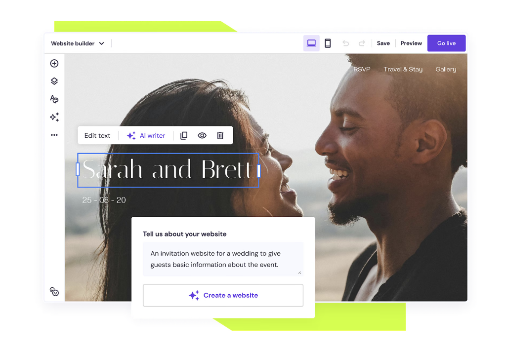
With Hostinger’s wedding website builder, you only need to answer a few simple questions about your wedding, and the AI Website Builder will automatically generate a personalized wedding website. You can then use the intuitive drag-and-drop editor to customize the design to fit your vision.
If you need help with content creation or selecting the perfect images, there are AI tools for that too. The AI Writer helps write engaging content for your site, and the AI Image Generator creates high-quality images instantly, based on a description of your needs.
To get started with Hostinger Website Builder, follow these steps:
- Choose a website plan. The Premium plan starts from $₱109.00/month, and comes with a free domain when you subscribe for 12 months or longer.
- Sign up. Create an account as part of the purchase process.
- Start building your website. Choose a ready-made wedding website template, or use the AI Website Builder.
- Connect your domain and publish your site. When you’re done, use our domain checker tool to find the perfect domain for your wedding site. Then, publish your site.
2. Choose a wedding template
Choosing the right wedding template helps set the tone for your big day and makes it easy for guests to find all the important details, like the venue, date, and RSVP options, ensuring they feel welcome and excited to attend.
When selecting a website template, focus on these four most important design aspects:
- Visual cohesiveness. Select a template with a harmonious color scheme that matches your wedding theme. Limit your palette to two or three main colors to maintain a clean and elegant look. Too many colors can create visual clutter and detract from the overall aesthetic.
- Typography and readability. Opt for clear, easy-to-read font styles that complement the overall design. Combining a decorative font for headings and a clean, simple font for body text often works best for consistency and readability.
- Balanced layout. Look for a template with a well-organized and balanced layout that guides the user’s eye smoothly across the page. Lots of white space and a clear structure help make the content easier to read.
- Mobile responsiveness. Ensure the template is mobile-friendly, as many guests will access your website from their phones. A responsive design that looks great and functions smoothly on smaller screens is important for providing your future guests with a smoother experience.
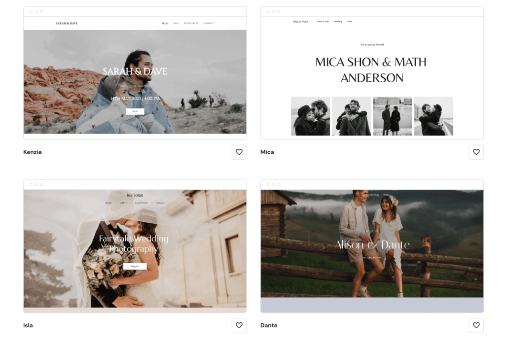
All Hostinger wedding website templates are designer-made, fully customizable, and automatically mobile-responsive. This ensures your wedding website looks great on any device while making it easy to tailor it to your unique style, regardless of your skill level.
3. Add essential pages
Generally, a wedding website should contain the following pages:
- Homepage. Add the most important wedding details and tell your guests to save the date.
- About us. Share your love story.
- Contact page. Inform visitors how they can contact you or your wedding planner.
- RSVP. Add the RSVP deadline for easier guest list management.
- Venue. Include a map to help people find the location. If you are planning something unusual, you can inform the guests about your wedding dress code here.
- Gallery. This is where you will share your wedding pictures. If you don’t want to share the images with everybody on the internet, consider using a password to restrict access.
To create a web page on Hostinger Website Builder, click on Pages and navigation → Add page.
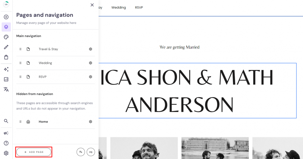
Choose a pre-built page design or opt for a blank layout. Use the drag-and-drop interface to add new page elements to fill your new page with content.
Now, let’s explore how the main web pages should look in more detail.
Homepage
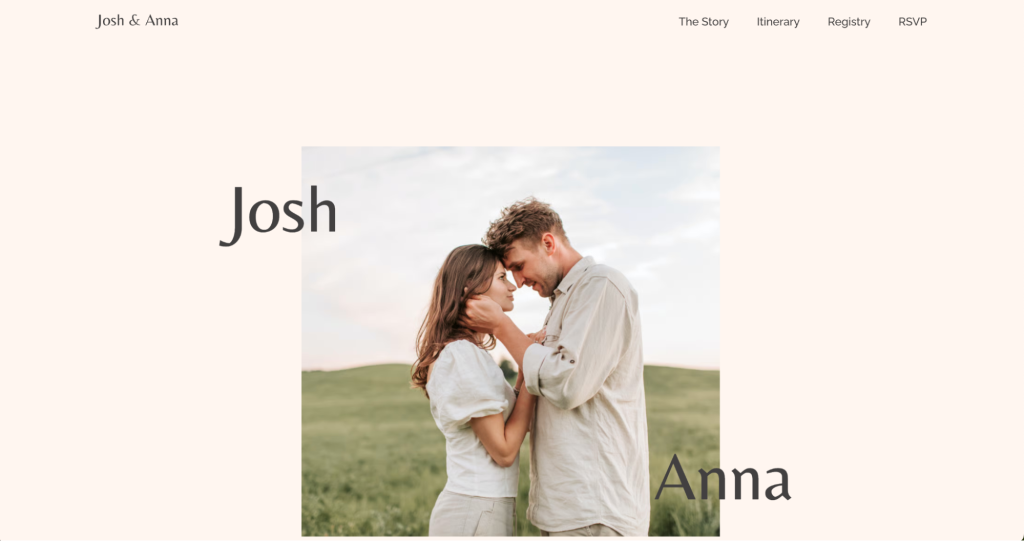
The homepage is the first impression your guests will have of your wedding website, so it needs to convey the site’s purpose clearly and capture their attention immediately.
Start with a large, eye-catching headline at the top of the page, highlighting your wedding date to ensure it stands out.
To encourage guests to take immediate action, include a clear call-to-action (CTA) button, such as RSVP Now.
About us page
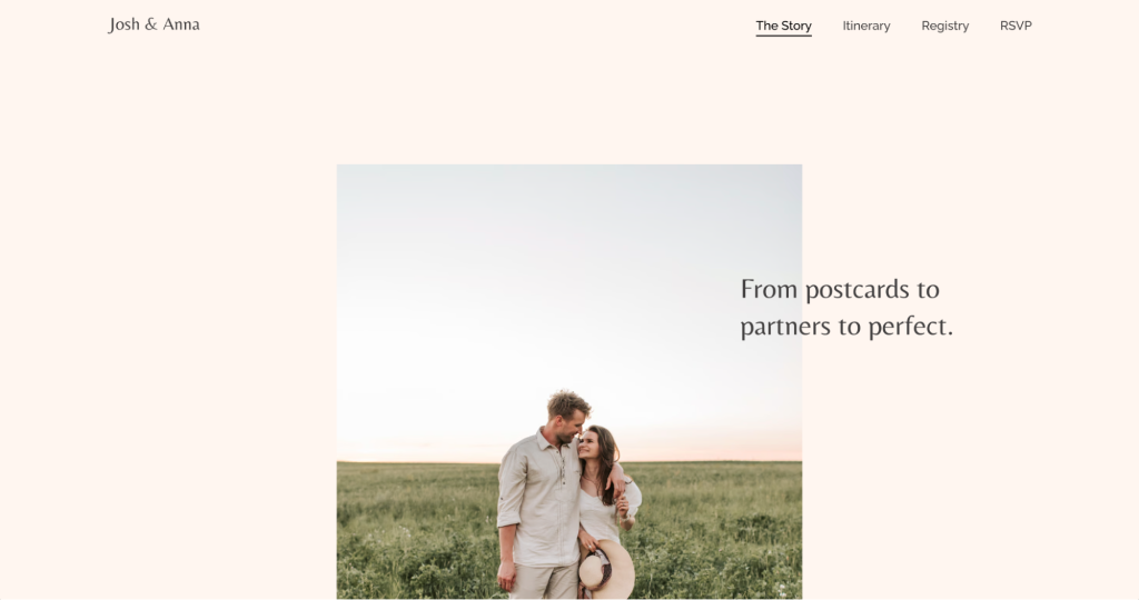
Add a personal touch to your wedding website with an About us page that shares your love story.
This section is a great way to introduce yourselves to guests who may not know you well or haven’t met your partner. Include details about how you met, your engagement story, and what you love about each other.
Incorporate personal anecdotes, photos, and heartfelt messages to help your guests feel more connected to your journey as a couple. If you have guests from different countries, consider adding translations to accommodate them and make them feel welcome.
Contact page
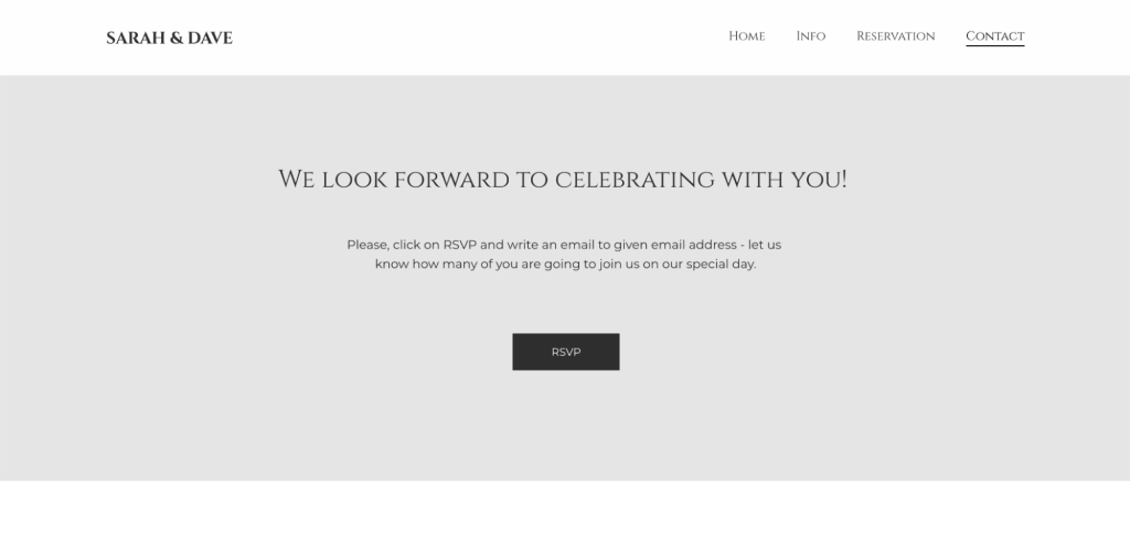
The Contact page is essential for providing your guests with a way to contact you or your wedding planner. This page typically includes your contact details, links to your social media profiles, and a map showing the location of your wedding venue.
With Hostinger Website Builder, you can easily add a contact form for guests to submit inquiries directly on the site.
You can customize the form to store responses in your site’s database or send them directly to your email, depending on your preference. Make sure to include the following information on your Contact page:
- Event location. Provide the full address of your wedding venue along with an embedded map, directions, and parking information to help guests find their way.
- Contact phone numbers. Include both your contact number and your wedding planner’s, ensuring guests have someone to reach out to in case of any last-minute questions or emergencies.
- Social media links. Integrating your social media profiles makes it easier for guests to share photos and updates.
- Clear instructions. Provide concise instructions next to each form field to guide guests in filling them out correctly.
Pro Tip
Consider creating a QR code for your wedding RSVP, and linking it directly to the Contact or RSVP page on your wedding website to make it easy for guests to confirm their attendance. This ensures a seamless experience and helps you get responses quickly.
4. Personalize your content
Personalizing your wedding website with meaningful content makes it more engaging and memorable for your guests.
This is a great opportunity to introduce yourselves and share your stories, especially for those who may not know you well.
Here are some best practices for adding photos, videos, and other interactive elements to your wedding website using Hostinger Wedding Website Builder:
Add a photo gallery
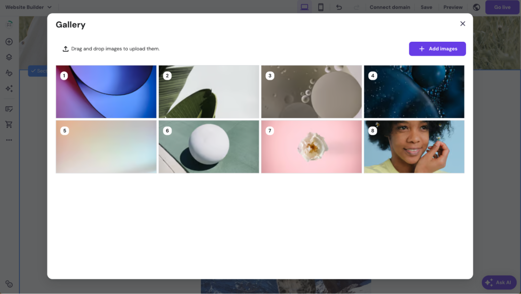
Select the Gallery element from the Add elements menu and drag it onto your page. This helps you showcase multiple images in one place, such as engagement photos, pre-wedding events, or childhood memories.
To customize your gallery, do this:
- Click on the gallery element and choose Manage gallery. Then, click Add Images to upload high-quality photos that reflect your style and personality.
- Remove any default images by selecting them and clicking the trash icon.
- To adjust the look and feel, select Edit gallery and modify the Gallery settings like layout, number of items per row, and spacing between photos. This ensures your gallery looks clean and organized.
Incorporate videos
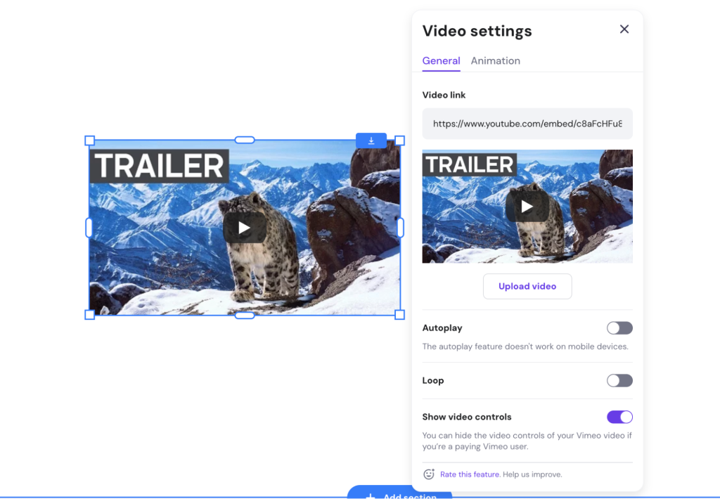
Videos are a powerful way to tell your story, share messages, or even showcase a short highlight reel of your relationship.
To add a video, follow these steps:
- First, upload your video to a platform like YouTube or Vimeo.
- Then, drag the Video element onto your page, click on it, and select Edit video.
- Enter the URL of the video in the Video settings. Determine whether you want the video to play automatically or loop.
- For a more streamlined look, turn off Show video controls to hide the play, pause, and volume buttons, reducing distractions.
Organize content with sections
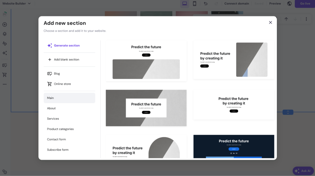
Use sections effectively to organize different types of content on your pages.
For example, create distinct sections for Our Story, Photos, Videos, and Guest Messages.
This helps visitors easily navigate through the content and keeps the design tidy. In Hostinger Website Builder, you can add new sections by hovering between two existing sections, clicking Add Section, and choosing from various pre-designed layouts.
Use text overlays and captions
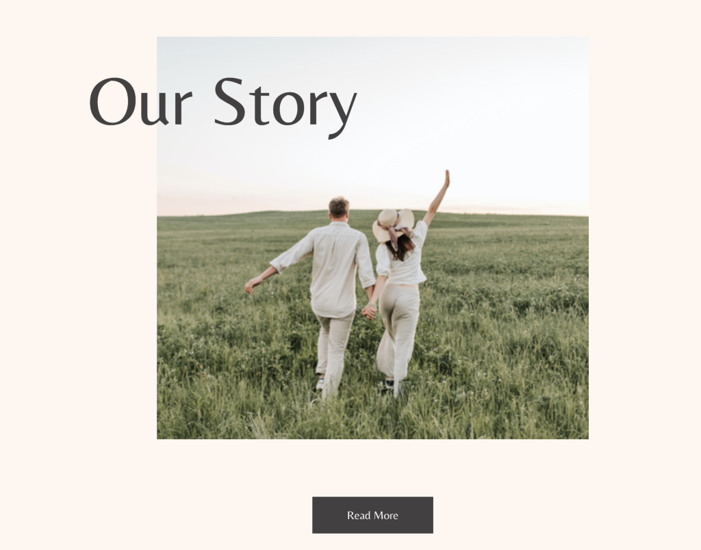
When adding photos and videos, consider using text overlays or captions to provide context.
For instance, add a short caption under each photo in your gallery to describe the moment or memory it represents.
This small detail can add emotional depth and help guests feel more connected. Hostinger Website Builder lets you easily add and customize text elements directly on your images.
Add a Behind the Scenes page or section
Create a Behind the Scenes section where you share candid moments from wedding planning, like dress shopping, cake tasting, or venue visits.
This adds a personal touch and can be especially engaging for guests who are excited to see the journey leading up to your big day.
Incorporate interactive elements
Engage your guests with interactive elements like polls, quizzes, or a guestbook. You can ask fun questions like Guess how we met or Share your favorite memory with us.
This encourages guests to interact with your site and feel more involved in your celebration. Use the Form or Embed Code elements in Hostinger Wedding Website Builder to add these features.
5. Integrate a countdown timer
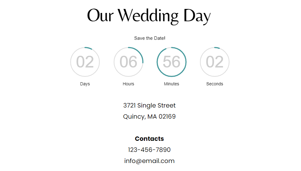
A countdown timer is a great way to create excitement and encourage guests to RSVP and mark the date on their calendars. Embedding a countdown timer on your wedding website adds a sense of urgency and keeps the anticipation alive.
To add a countdown timer, you can use a free online tool like LogWork to generate the timer code. Simply complete the form with your wedding date details and click the Embed on your website button to copy the code snippet.
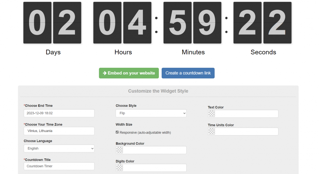
In Hostinger Website Builder, you can easily integrate a countdown by using the Embed Code feature. In the Add element menu, select Embed code and drag it to the desired spot on your page.
Click on Enter code to open the custom code editor, and paste the countdown timer code snippet.
After adding the code, you will see a countdown timer that looks like this:
6. Include a gift registry
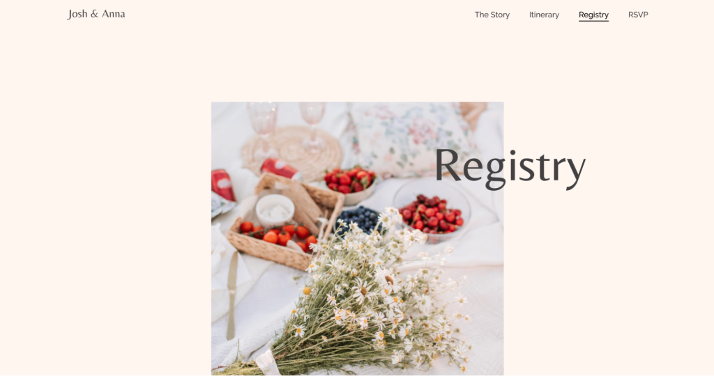
Including a gift registry on your wedding website makes it easy for guests to choose gifts that you’ve carefully selected, streamlining the process and ensuring they find something you truly want or need.
Your registry can also be linked to pre-wedding events, such as a rehearsal dinner or bridal shower, providing a one-stop solution for all gifting needs.
To make your gift registry as helpful and guest-friendly as possible, consider these tips:
- Provide multiple options. Link to different stores or online platforms to offer a variety of price points and gift types. This ensures all guests can find a suitable option regardless of budget.
- Include non-material gift options. Some guests may prefer to give experiences or donations rather than physical gifts. Include options like contributing to a honeymoon fund, sponsoring a date night, or donating to a favorite charity in your name.
- Add descriptions and notes. For each item on your registry, include a short description or personal note explaining why it’s meaningful to you. This adds a personal touch and helps guests feel more connected to their choice.
- Make it easy to access. Ensure your gift registry is easy to find on your website by adding a clear link or button on your homepage or navigation menu. Label it simply so guests know exactly where to go.
- Be thoughtful with your wording. When sharing your registry details, use warm, appreciative language to express how grateful you are for any gift while also emphasizing that their presence at your wedding matters most. This helps set a gracious tone and avoids appearing overly focused on gifts.
- Keep it updated. Regularly update your registry to reflect any changes, like items that have already been purchased or new items you’d like to add. This ensures guests always have up-to-date information.
8. Publish and share your site with the guests
Before going live, thoroughly preview your wedding website to ensure that everything works perfectly. Check that all links direct to the correct pages, all elements are displayed properly, and there are no typos or errors.
Also, review how your site appears on mobile devices to confirm it is mobile-friendly. Click the mobile view icon in the website builder’s top navigation bar to see how the website looks on smaller screens, and make any necessary adjustments directly in the mobile view.
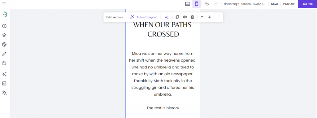
Once you’re satisfied with your website’s looks and functions, exit the Preview mode and click Go Live to publish your wedding website. This action will also automatically create a backup of your site files, ensuring you can restore them if needed.
After publishing, enter your wedding website URL in your browser to perform a final check. Test forms, such as the RSVP or Contact us page, by submitting mock data to confirm they work correctly. If you find any issues, make the necessary edits and click Update to apply the changes.
Next, it’s time to share your wedding website with your guests. You can distribute the link through various channels – post it on your social media accounts, share it in family and friends chat groups, or send a personalized email invitation to each guest with the website link. This ensures everyone has easy access to all the important details about your big day.
3 wedding website examples to inspire
Let’s explore these top wedding website examples that balance creativity, user-friendliness, and elegance.
1. Sonita & Brian
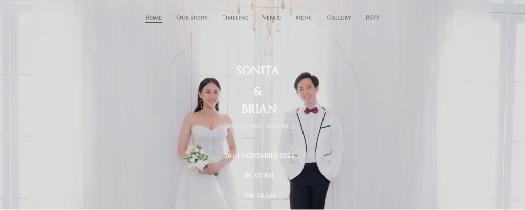
Sonita & Brian, built with Hostinger Website Builder, is one of the most beautiful wedding website examples on our list.
The website’s color palette predominantly features soft hues of white and pink, setting a tone of subtle elegance. The homepage showcases a full-screen background photograph of the couple – the bride in her exquisite wedding dress and the groom in his tuxedo.
The wedding ceremony information is clear and well-organized, stating the event’s date, time, and location. There is also a countdown feature.
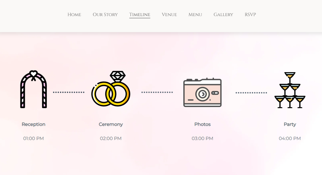
A standout feature is the Timeline page, which is creatively designed with 2D icons to inform visitors of the day’s events.
The Menu page is also a nice addition, making it easy to share details about the food and drinks that will be available at the wedding. Additionally, the website includes a collaborative photo gallery where guests can upload their captured moments from the event.
Why we chose this website: Its visually appealing and informative tone is perfect for making guests feel connected and excited.
How to recreate: Use a cohesive color palette, clear event details, and engaging interactive elements like photo galleries.
2. Andre & Tina
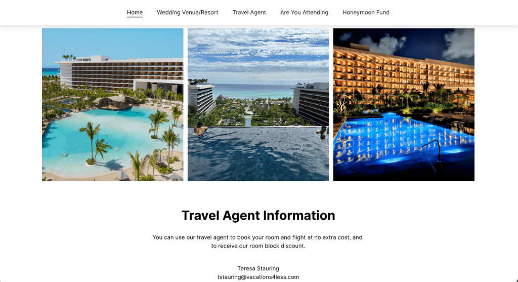
The wedding website of Andre and Tina, aptly titled the Best Wedding of 2024, is a superb example of a destination wedding website design. This site features an exotic and elegant theme, highlighting the picturesque wedding venue.
One of the most notable aspects of this website is its focus on guest convenience. The homepage greets visitors with vibrant photos of the resort and essential wedding details, including the date and location. It includes a travel agent booking option, making it easy for guests to secure discounted room rates and streamline their travel arrangements.
The site also includes an intuitive RSVP form, enabling guests to confirm their attendance quickly and efficiently. There’s also a dedicated section for contributions to the couple’s honeymoon fund, enabling guests to give meaningful gifts with ease.
This wedding website perfectly blends functionality and visual appeal, making it a top choice for couples planning a destination wedding. By incorporating these elements, you can create a wedding website that enhances the overall guest experience and simplifies planning.
Why we chose this website: This website focuses on guests’ convenience, which becomes more important when the wedding takes place abroad.
How to recreate: Incorporate vibrant imagery, a travel agent booking option, and an intuitive RSVP form.
3. Denise & Dennis
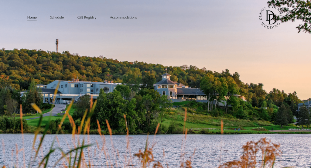
The wedding site of Denise and Dennis’s wedding has a clean, modern design and user-friendly layout. Key event details, including the date, time, and location, are prominently displayed under the hero section, ensuring guests can easily access essential information.
The web design is sleek and minimalistic, featuring a well-organized navigation menu that guides visitors through the site effortlessly.
A notable design feature is the integration of the wedding day timeline, which provides a clear and visually appealing schedule of events. This helps guests understand the flow of the day and prepare accordingly.
Why we chose this website: The sleek design and organized timeline help guests easily navigate and prepare for the event.
How to recreate: Use a clean layout, clear navigation, and a visually appealing event timeline.
Customer story: How Brian used Hostinger Website Builder for his wedding website
Brian wanted a builder that was easy enough for his non-tech-savvy wife to use, yet offered the flexibility he needed. After exploring several options, he found that Hostinger Website Builder provided the best balance of simplicity and customization, making it easy to create multiple templates and pick the perfect one for their wedding theme.
Brian started by setting up the site’s framework and customizing it to reflect their story. His wife, on the other hand, contributed by writing their Our Story page. The builder let Brian restrict the guest list to “invite only”. This made it easy to share the news with a wider circle of friends and family in one go.
Brian’s guests loved the website’s design and functionality, finding it easy to navigate and use. The happy couple themselves were pleased with how the website simplified their wedding planning.
Favorite features
- Responsive design. Brian appreciated the ability to easily adjust layouts and images for different devices, ensuring a consistent look across desktops, tablets, and phones.
- Photo sharing. To avoid the hassle of sending photos individually, Brian linked the site to a Google Drive folder, letting guests upload and download images seamlessly.
- Simple management. The intuitive admin panel helped Brian to manage domains and settings easily, which he valued as an IT professional.
Conclusion
A wedding website helps to simplify wedding planning and ease communication with your guests. It brings all the essential details together in one place, saving time and costs associated with printing and mailing traditional invitations.
In this guide, we’ve walked you through the key steps to create a wedding website that simplifies your wedding planning by providing you and your guests with most of the important information in one place. Here’s a quick recap:
- Choose the right website builder and template
- Add essential pages, like Home, About Us, RSVP, and Gallery
- Personalize your content with photos and videos
- Add features like an RSVP form, countdown timer, and gift registry
- Test your site, publish it, and share it with your guests
By following these steps, you can create a beautiful, functional, and memorable wedding website that will keep everyone on the same page. Start building your wedding website today with Hostinger Website Builder and make your special day stress-free and organized.
How to make a wedding website FAQ
What to include in a wedding website?
Wedding websites should include a homepage, an about page, a gallery, an RSVP form, a gift registry, and important details about your wedding party. Be sure to include your contact information so guests can easily contact you.
Is it worth it to build a wedding website?
A wedding website is an excellent choice for those seeking an affordable and easy way to make wedding invitations and manage the guest list. For those who don’t know how to make a website, website builders provide templates and tools for customization without requiring coding or design skills.
How much does it cost to make a wedding website?
The pricing for a wedding website builder varies depending on the subscription plan. With Hostinger Website Builder, you can get started at just $₱109.00/month, including a free custom domain name and web hosting.
What’s the best way to share your wedding website with others?
The best way to share your wedding website is by including the link or a QR code in your Save the Date cards, invitations, and personalized emails to guests. You can also share it via chat groups and social media to ensure everyone has easy access. Learn more about how to create a QR code for wedding RSVP in our tutorial.


